When it comes to the home, we all want to feel comfortable. One way to maximise comfort in the home is by adding a feature wall, be it a calming lick of paint or a sumptuous metallic sheen.
To find out more about feature walls and how different colours and themes can affect your emotions and environment MyJobQuote sought the help of Lee Chambers, Environmental Psychologist.
Chambers notes: “In colour psychology, there are trends that can be attributed to certain colours, and as feature walls are an amplified focal point in a room, our eyes are naturally drawn to them.” MyJobQuote also analysed the popularity of each colour by looking at the number of hashtags on Instagram (e.g. #greywalls).
Green: Restful to our mind, with a refreshing quality. Green has a warmth to it and projects a person who values growth and nature. This is the most popular colour on Instagram with 73,902 tags for #greenwalls.
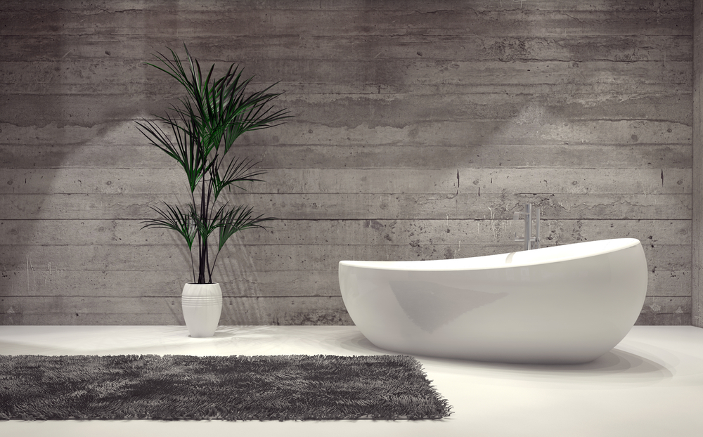
Grey: Very fashionable with a subtle elegance, the effect of the colour grey is highly dependent on the shade. Combined with white it looks refreshing, crisp and airy. If too dark or overpowering it can lead to darker and depressed feelings. Grey is also the second most popular colour on Instagram, with 47,106 hashtags.
Blue: Versatile, calming, and serene. A great colour if you are a relaxed soul, but certain shades can feel a little cold, and others evoke an element of sadness. Blue walls are certainly a popular choice with 38,799 Instagram hashtags.
Pink: Pink creates a soothing, comfortable atmosphere, and can be used to transmit a feeling of personal preference as a colour with rigid connotations. A moderately popular choice according to Instagram, with 37,371 hashtags.
Red: This colour expresses energy and excitement. It is rich and elegant, and certainly stimulates people to converse and connect. Red walls have also collected 21,865 hashtags on the ‘gram.
Yellow: Yellow walls generate a spacious and welcoming aura and depending on the shade, it can amplify a sunny disposition. However, it is best used in small amounts as it can cause anger and frustration more than any other colour. Yellow walls gained a total of 13,072 hashtags.
Purple: A rich, luxurious colour that provides depth, Purple exudes nobility and creativity, and brings a balance of energy and relaxation that bold individuals resonate with. Purple is the second least popular of the colours on Instagram with just 7,163 hashtags
Orange: The colour of energy and the bastion of individuals who like to make a statement of their vibrant personality. However, orange might be too vibrant for some as it is the least popular of the colours analysed, with a meagre 4,909 hashtags on Instagram.
When it came to colours to avoid, Chambers adds: “Yellow as a main colour has been shown to make babies cry more often, and cause tension to increase in adults. Red and Orange are great for energy, and stimulating the senses, however certain shades when subject to lighting can become so fiery certain individuals report feeling more aggressive and less compassionate. And Crimson has been identified as a colour to avoid for those whose passion can easily overflow. Too much Black can also induce feelings of darkness and solitude.”
Feature Wall Designs
MyJobQuote selected a few feature wall designs and analysed their psychological effects with Lee Chambers.
Wood Panelling: More popular in certain cultures or in the boardroom, wood panelling has been shown to incite feelings of nature, but only on those who have a preference towards them. This is because wooden surfaces can trigger and stimulate our senses.
Wall Mural: Murals are often more than decoration, and more of an expression of art. They have the power to pull you to the environment that is pictured and can trigger you to evoke positive emotions attached to the imagery.
Metallic: Metallic walls are another way to integrate a natural element and can add depth and sophistication. Psychologically they can be grounding, especially bronzes and darker silvers, and convey a certain feeling of strength and fortitude.
Geometric Patterns: This option is interesting as different shapes and patterns can confer different feelings. Squares convey stability, circles communicate harmony and life’s cycles, and complex shapes amplify your personal preference. Triangles are adaptable. Pointing up they give a feeling of purpose and progress, while upside down they can feel less stable and more grounding. Pattern density can also confer meaning, too busy can create anxiety for some people.
Stone: Often the mainstay of kitchen worktops and bathrooms. Another natural element that promotes strength, resilience, and roots us in nature, which for some people can help us to destress and disconnect.
Image Credit: (Shutterstock/PlusONE).